

UX & UI / Research / Design Concept / Case Study
Project : Instashop | Date : Summer & Winter 2016 | Client: Design Lab


Overview
With the continued advancements in technology and convenience, Instashop believes there is an opportunity to change the way people shop for groceries by providing a way to do grocery shopping online. Our goal is to better understand who our target market is and how to make Instashop appealing to customers.
Methodology
Questionnaires: First we will need to gather quantitative and qualitative data to understand whether this is a need across a variety of different demographics or if it is a niche demographic that we should be focusing on.
Interviews: Conduct interviews to understand what pro-online shoppers would want to see for online grocery shopping, and understand what is preventing those wary of online grocery shopping from trying it out. During these interviews, we will also learn about what each interviewees’ shopping habits are.
Participants: College student, working professionals, and stay-at-home moms.
Card sorting
I consulted with a few volunteers to help sort these cards to best align with their grocery shopping experience. The below is the final categorization.


Sitemap
Next, I started putting together a sitemap to make sure that the site flows seamlessly and everything is clear and concise. After I was happy with the final sitemap flow, I was able to proceed to the next step: wireframing.

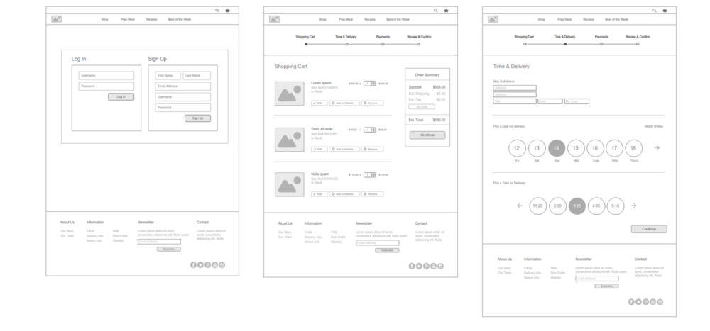
Wireframes
This is a rough sketch of what the final output may look like. I incorporated a lot of the things in the wireframes that a user will want to see in a product. While the final product may not look like the wireframes, this gives me a sense of direction of what the final product will look like.

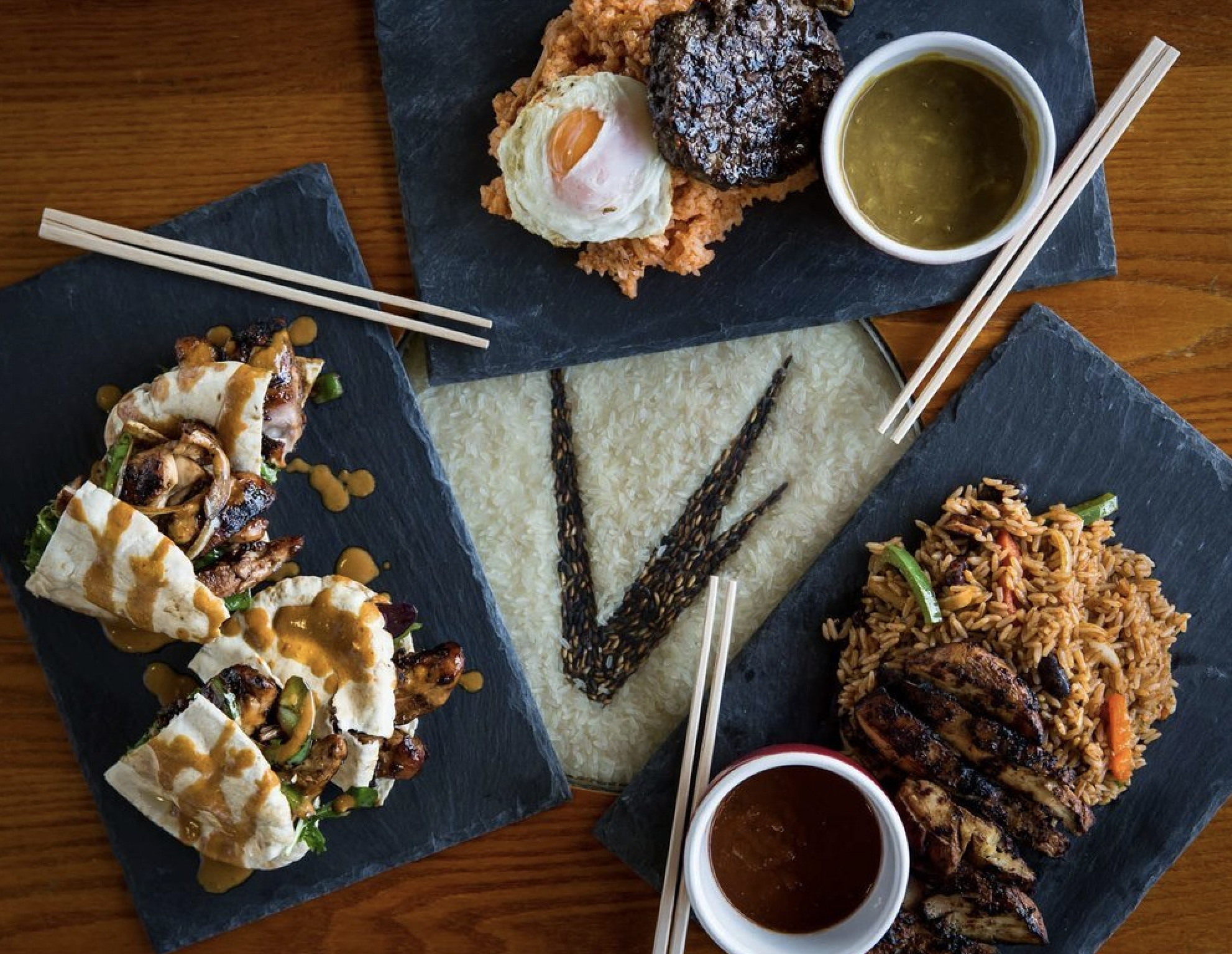
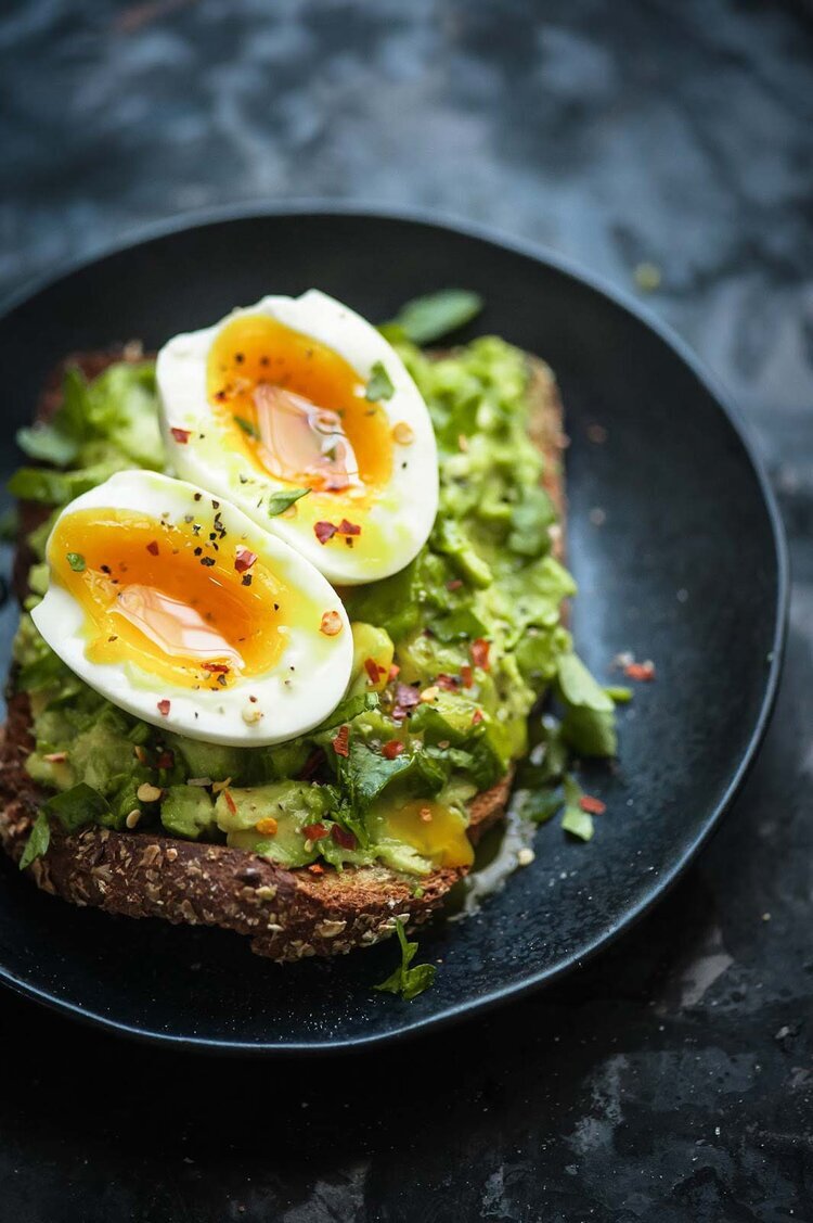

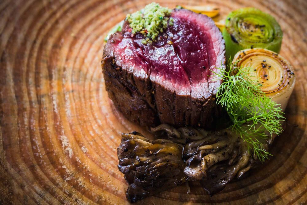

Moodboards
These are few of the inspiration pictures that got me thinking about what the Instashop website would look like. My initial take is to keep the urban feel that these photos convey while maintaining a clean but modern website.
